Viewing entries in
Company Signs

The Types of Outdoor Business Signs That Can Help Your Company Stand Out

Comment

The Types of Outdoor Business Signs That Can Help Your Company Stand Out

Visibility is crucial for succeeding with any kind of brick-and-mortar store. Outdoor business signs are an excellent means of making your existence known to possible customers. They also help direct people who already intend to do business with you right to your doorstep.


Making an Effective Outdoor Business Sign

When you buy an outdoor business sign, you are making a big investment. Outdoor business signs can range from $1k - $10k or more. So before you spend your money on such an expensive and essential marketing item for your store, it’s vital to know what it takes to create such an amazing piece of ingenuity that’ll bring people to your front door.


The Right Wording

Keep the word count limited. The best outdoor business signs will clearly represent the image and name of your store in only a few words. And according to advice from Intuit, your business sign should contain no more than 7 words. Therefore, it’s perfectly fine (and probably even preferable) to have less than 7 words. However, you should not have more than 7 words if you want to have optimal results.


The Key Message Only

It’s difficult to elaborate on all the things you’d like to mention about your store in just 7 words or less. But, with your outdoor business sign, all that needs to happen is to let possible customers know the location of your business and guide them into the door. Those few words on your sign only need to inform them what they absolutely need to know before going into your store. Some of the types of information you may consider including on the sign are:

  • Call to action

  • Company name (mandatory)

  • Slogan

  • Address

  • Twitter handle

  • Website URL


Write It for People on the Move

Don’t forget that folks will most likely be reading your outdoor business signs when they’re in a moving vehicle. According to the US Small Business Administration, your sign should be readable even for people “whizzing by in a car going 45 miles an hour.” This is why, therefore, you’ll want to limit the information on your sign as much as possible. After all, why risk losing customers by including unnecessary information that would possibly prevent them from reading the most important parts (like your company name)?


Make It Consistent With Your Brand

Outdoor business signs should reinforce the brand of the business. This means linking the appearance of your signs with that of all your communication and promotional elements, including advertising. So, your logo and other marketing items should stay consistent as well.


Consider the Font

Going off of brand consistency, you should stick with the same font in your signage logo. However, this is only true if your lettering style is a readable typeface from afar. If not, then pick an alternative font that’s as close as possible to your logo but will also look good in a larger format. Some good choices for commercial signs are Future, Bodoni, Helvetica, Grammond, and Frutiger. Also, we here at Midtown Signs suggest not using more than 2 fonts in one sign.


Capitalization

For most people, signs in all capital letters are actually harder to read than signs that have a good mix of lowercase and uppercase letters. Therefore, stick with the title case for your sign’s content.


Color Contrast

While it’s important that your colors remain consistent with your other branding and marketing efforts, they should also be readable. So, using contrast is a smart idea. Consider the fact that green on blue isn’t readable, but yellow on black, for example, is a lot more visible. The combination with the highest contrast and the greatest visibility is black and white. Additionally, it does not matter whether you go with black lettering on a white background or vice versa.


The Focal Point

You should establish a focal point on your signage, putting the essential information in a place that will captivate and hold people's attention. Keep in mind that people usually read from left to right and top to bottom. Therefore, you should normally place the focal point around the upper left of the signage.

Outdoor Business Sign Examples

Getting your message across to potential customers is the key to business success. Using outdoor business signs effectively has a key role in that because you’ll be able to attract a live audience. Professional outdoor business signs can put your brand and promotions on display 24/7.

Choosing the right kind of sign demands strategy, planning, and some additional insight. To that end, here are a few of the best outdoor business sign ideas for you to get ideas and inspiration from.


3D Signs

These make excellent outdoor business signs, and you can get a lot of ideas and inspiration from them. That’s why they are popular with nearly every kind of business enterprise. They provide lots of creative potential for bringing amazing sign ideas to life. There are tons of options for dimensions, fonts, shapes, and colors. Your goal should be to bring your exterior and interior image into harmony while remaining true to your brand image. With that being said, do not worry about personalizing your ideas on outdoor business signs.


Illuminated Signs

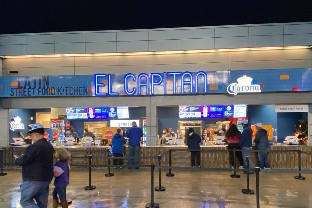
Create additional visibility for your branding plan and allow your outdoor business signs to keep advertising night and day! Signs that are lit up will allow your written messages to reach a larger audience. This kind of custom sign also lets you choose among free-form style options. Also, if you choose a sign that can glow during the night, then the power of your branding message will double!


Channel Letters

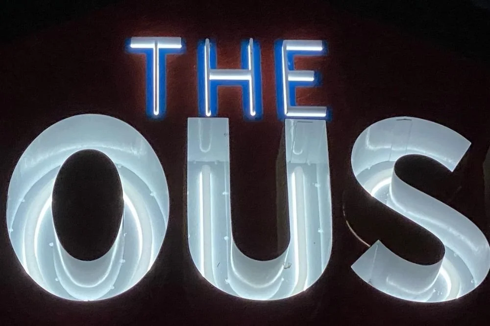
This one is very cool. It’s an illuminating outdoor branding feature that can be placed right on the wall or on a backing panel. This idea is commonly incorporated into commercial building signage. They create more depth with their 3d look that’s accentuated further with appropriate lighting. These can also be combined with other commercial signage-related ideas (illumination optional).

Comment

How to Use a Custom Sign to Create Ambiance for Your Restaurant

Comment

How to Use a Custom Sign to Create Ambiance for Your Restaurant

Does your restaurant have a story to share? When you create an ambiance for your restaurant, people tend to immediately think about art, color, flooring, furniture, and so on. However, it's important not to neglect signage. Your restaurant sign is a critical component of your restaurant's overall décor package.

You must have heard the saying, "if these walls could talk…." Guess what? Walls do talk, and everybody listens.

Midtown Signs is a commercial signage company that helps to raise its customers' revenue by creating the best commercial signage in Kansas City as well as the midwest. And your walls (both exterior and interior) are excellent places to share your story with people. Therefore, if you set the scene right and make good on your promises to customers, delivering the goods and services they expect, then your restaurant will be set up for success in your community.


Why Invest in Restaurant Signs for Business Ambiance?

Think outside the box! Allow your brand colors and story to spill over onto the walls, around corners, and across the floors. A commercial signage company will help you set up your business in the following ways:

  • Customer experience

  • Values

  • Brand personality

  • Identity

  • Messaging

Your brand is unique, after all. Also, what a brand represents is usually intangible. Oftentimes, it's only a feeling. Midtown Signs will manufacture, build, and install the best commercial signage that perfectly encapsulates your restaurant's personality in a physical, three-dimensional, and colorful way.

When you invest in the best restaurant signage, it's a win for everybody – the diners, staff, and restaurant owners. That's because having the proper atmosphere in your store will encourage customers to stay and drink more, eat more, and spend more time in your restaurant.

Additionally, they'll be motivated to share their experience on social media, recommend your restaurant to their friends, and become repeat customers. Word of mouth is the greatest method of marketing at your disposal because it gives your business a more permanent place in your community. In other words, it adds longevity.

Here are more benefits of investing in commercial restaurant signage:

  • More foot traffic into your restaurant

  • More chances of getting shared across social media

  • Better tips from customers

  • Happier employees

  • Making full use of empty space

  • An excellent way to generate word of mouth advertising

  • Increase your following on social media

  • More drink and food sales

  • High-quality design that reflects well on your business

  • A high-quality sign will engage and excite customers.


Put Yourself in the Customer's Place

Lots of restaurant owners believe that all that's required is to put up a few signs outdoors, and everyone will just rush inside. However, customers today are too smart for that. While it's true that the customer experience starts in the parking lot, it also will continue once they exit the building (and even when visiting the restrooms).

Ask yourself what you think your customers are feeling when they enter your restaurant? How would you feel when entering a restaurant similar to yours? What sort of things are your customers expecting? Do you meet and exceed their expectations, or just do the bare minimum that's necessary?

Here is a list of signs that are both functional and decorative:

  • Floor signage

  • Interior signage

  • Wall graphics

  • Custom outdoor signage

  • Façade signage

  • Exterior signage

  • Hanging signage

  • Environmental graphics

  • Wayfinding signs

  • Ground signage

  • Window and door signage

  • Storefront signage

When your restaurant's environment matches your branding, its personality will be expressed via color palettes, graphic elements, typography, and brand assets. When used appropriately on the surfaces in your restaurant, diners will feel encouraged to interact.

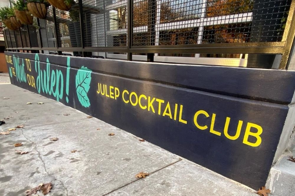
Julep Cocktail Club sign


Dazzle Diners With Colorful Restaurant Signage and Décor

Now, after you've put yourself in your customer's position and thought about some potential types of signage you could use, it's time to get into the nitty-gritty. Let's talk about color psychology and why you should consider the benefits of digital signage for creating ambiance in your restaurant.

Your décor and signage are an excellent method of calling attention to your restaurant as well as conveying what kind of ambiance it has. While décor is nearly always used exclusively for ambiance purposes, signage is used for both decorative and functional reasons (like showing diners how to navigate throughout your restaurant). However, regardless of whether your signage is decorative or functional in nature, ensure that the signage is consistent with the rest of the ambiance you're trying to promote.


The Psychology of Colors

Think of the usage of different colors as a form of subconscious communication with your diners. According to research, colors do affect drinking and eating behaviors. Here's how:

  • Orange and yellow make people feel happier and less guilty about eating sweets.

  • Blue makes people feel thirsty and encourages ordering drinks.

  • Green encourages healthier eating and promotes the use of natural ingredients.

  • Red makes people feel hungrier and want to buy more food.

You might think that it's easier said than done to change your restaurant color theme. After all, your restaurant would need new paint, flooring, lighting, and decorations, including furniture. Thankfully, there's a shortcut to doing this, and that is digital signage.


Digital Signage for Creating Restaurant Ambiance

Digital signage is an economical solution, especially for smaller-sized restaurants. It's an easy and quick way to set and change the color theme of the restaurant. Place the signage somewhere that's visible to people eating in the restaurant, at eye level. Doing this removes the need to color the entire restaurant.

Besides the cost benefits, there's another advantage of utilizing digital signs in restaurants. Rather than just plain colors, you can show an array of vivid images belonging to a specific color theme. For example, if using yellow, a smiling girl holding up a bunch of bright yellow balloons will fill people with joy as well as a craving for sweets.

To start with, you can create some digital signage campaigns with both video and music and then play them in your restaurant to witness the effects they have on diners as well as the restaurant staff. These days, digital signage from a commercial signage company will allow you to schedule the campaigns you created for use in playlists! That way, you can play each one at the right time and the right place. 

Comment

The Art Behind Integrating Floor and Window Graphics Within Your Business

Comment

The Art Behind Integrating Floor and Window Graphics Within Your Business

FLOOR GRAPHICS

The floor is often overlooked and underutilized as an advertising space. After all, it would seem like an unusual spot to put an advertisement. It’s for that same reason that it can be one of the greatest methods of advertising available. It gives you the chance to shake things up and speak boldly to your patrons. At the most basic level, they can also help customers with wayfinding. Another simple use for floor graphics is plastering your logo design in appropriate spots. We’ll go into these options in more detail below.


Wayfinding

These can help your customers find your best deals and discounts. While simple shelf-mounted markers are an option, it’s more effective to include floor graphics depicting arrows, dollar signs, or footsteps. This idea also applies to seasonal events – help your customers find your gift-wrapping stations or shipping counters. Floor graphics become even more useful and effective when you need to direct large crowds.


Branding

Fostering brand awareness means repeating the promotion of specific product types that you’d like to be known for. First, you’ll want to connect the name of your store with the product you offer. Doing so will make you the go-to choice in the minds of consumers, and they will go to your store whenever they need that specific item.

Now back to floor graphics. You can put some at your store’s main entrance, and it should let shoppers know of any specific brands in your store.

Another great tool for creating brand awareness is co-branding signage. With this type of ad, you put your store logo and name along with the manufacturer’s name and logo. You can be pretty generous with this type of floor graphic and put them all around your store.


Bold Statements

Excellent use of vinyl floor graphics to display mission statements, sayings, mottos, or tag lines. When kept short, these bits of text define who you are as an institution or business. These floor graphics make it easier for people to connect you to your words, which will create the right kind of atmosphere in your store. Customers will have new expectations of you, and when your staff is able to meet those expectations, customers will leave more satisfied. In fact, creating this kind of tone in this way for all manner of interactions is suitable in banks, stores, non-profit organizations, schools, and pretty much anywhere else.


Bring in More Foot Traffic

The best way to bring in more foot traffic to your store is to let people outside know what you offer. For example, if you stock the latest gadgets that everyone wants to have this holiday season, then you should put that in your floor graphics. Or perhaps you provide complimentary gift-wrapping and toy/furniture assembly upon request? Floor graphics will inform people about what you provide before they even enter your store. All you have to do is put these graphics right outside of your store. Keep in mind that floor graphics will attach to any kind of substrate, including carpeting, tiles, or rough cement. Therefore, it will be useful in any kind of setting – both outdoor or indoor.


WINDOW GRAPHICS

Window graphics can change pretty much any glass surface into the perfect advertising space. Whether it’s images in full-color, catchy and personalized messages, or fascinating patterns and textures, you can greatly customize window graphics. And to top it off, they serve a double purpose of resolving privacy problems in retail and business spaces.

Window graphics are available in lots of styles. They’re extremely versatile and simple to exchange when your business goals and needs change.


How to use Window Graphics for Marketing and Advertising

Here are some ways that you can effectively use window graphics for marketing and advertising.


Perforated Films + Patterns, Designs, or Full-Color Images

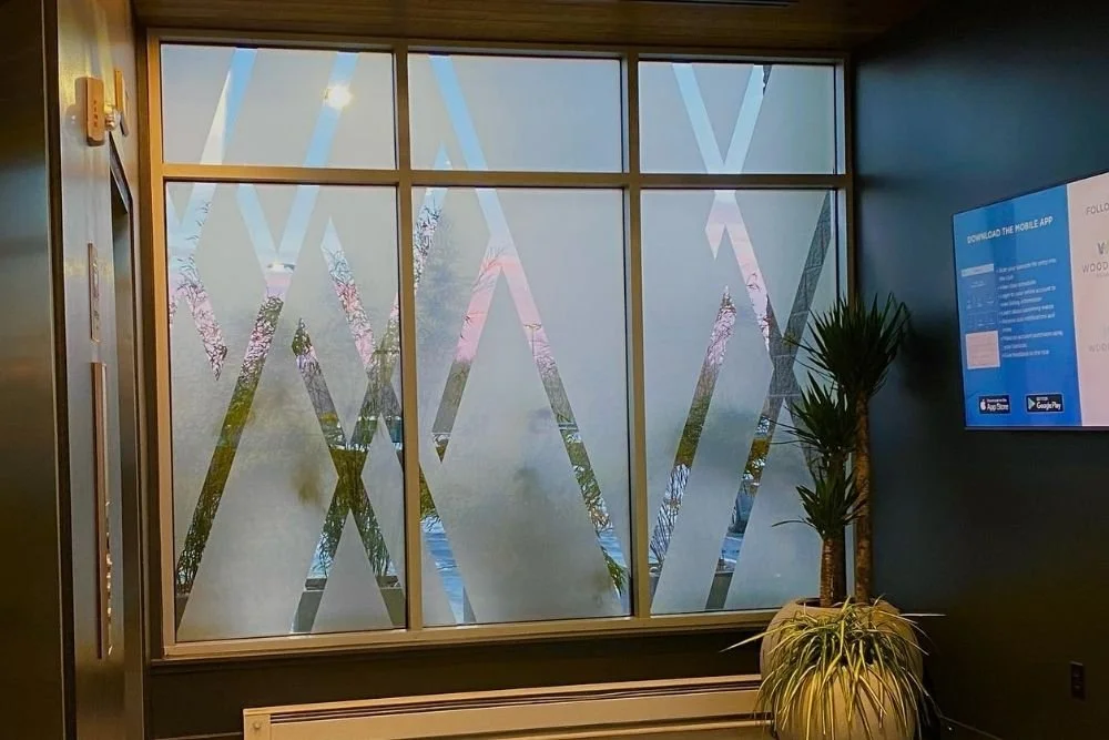
You can print a perforated window film in full-color patterns, like images or tie-dye. Additionally, these patterns create the best balance of aesthetics and privacy. Also, they lower glare and heat from windows and don’t make them look closed-off like blinds or other window options do.

When made with colorful, bright photos and patterns, they’ll get the attention of bystanders, whether they’re behind the wheel of a car or on foot. And finally, perforated films will provide visibility to the outside world.

 Static Cling Films

These are great for temporary promotions like product-specific specials or weekly sales. They also complement doors, storefronts, and glass windows. They’re also easy to swap out. If you don’t know what to say, our signage company in Kansas City can help you create any message or design that you’d like.


Custom Graphics

These work well for advertising available space or closed/empty storefronts, as well as other spaces for lease/rent. They work well to grab the attention of potential lessees, as well as hide the interior from bystanders (if using opaque graphics). Therefore, it’s an excellent way of covering up empty storefronts.


Custom Window Graphics Usage

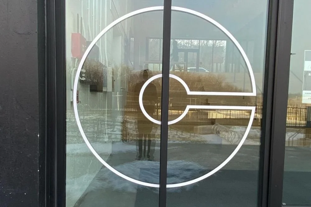
Custom window graphics can be used on a variety of glass surfaces to get the word out about your business, products, or services. Other than storefronts and windows, they can be used on foyers and glass entryways, glass doors, and glass railings. They may also be used on other (interior) glass surfaces too.

As you can see, the options for advertising with custom window graphics are endless. Whether it’s getting the attention of potential lessees or getting the word out about your latest clearance sale, a signage company in Kansas City can help spread your message with attention-grabbing graphics.


CONCLUSION

When you’re ready to discover more about window and floor graphics and how they will shape the way you do business this year, contact the professionals at Midtown Signs, a premier signage company in Kansas City, for more information. Our graphic artists will assist you in printing, wording, design, and locating the ideal spots for your graphics. Give us a call today to start the ordering process. 

Comment

Need Help Attracting Customers to Your Business? Consider These Sign Design Ideas

Comment

Need Help Attracting Customers to Your Business? Consider These Sign Design Ideas

McClain's Market outdoor sign

No matter where your business is located – nestled on a quiet street or on a busy pedestrian sidewalk, having the right type of commercial signage is crucial. A sign made by a commercial signage company will allow you to draw in customers and assist them with finding their way around your store.

Perhaps you want to quickly get people's attention with a quirky and unique message. Or maybe you'd like to advertise a new offer or discount. And finally, perhaps you just need to put some more signs around your establishment to help people find a specific product.

According to a FedEx survey, 91% of small business owner respondents agreed that readable graphics are important drivers of success for their business.

Let's examine different kinds of signs you may want to use. These signs can be used either outside or inside to create a better experience for the customers visiting your store.


Make First Impressions Count

Signs, banners, and posters that you place in your business are usually the first points of contact with customers. And this is common advice but bears repeating: first impressions are lasting impressions. It's your one shot to show off the image of your business that you want people to see and remember. And usually, people will judge or assume the quality of your store based on how it looks on the outside. Judging a book by its cover and all that. Therefore, the messaging and style of your signage are crucial for getting people to take a look inside your store and not just walking past it.


Know the Purpose of Each Sign

Before you order a sign from a commercial signage company, it's a good idea to create a plan for each individual sign you want. For example, if you want an outdoor banner, it’s probably because you want to advertise a new sale. A window decal, on the other hand, could be used to inform passersby when you'll be open for business. Crafting effective messaging for every sign that you have will be a lot simpler when you know the purpose that each sign will serve.


Choosing the Right Sign For the Occasion

People walking by your store are not just pedestrians. No, they're potential customers. Your storefront plays a vital role in attracting these folk to come inside and check it out. A-frame signs work exceedingly well for this purpose since they have two sides and can be read from either direction. 

Meanwhile, a chalkboard sign is better if you'll be updating the information regularly, and it also allows you to inject your own personality into it. For example, bars frequently add witty handwritten messages on these signs to encourage people to come inside.

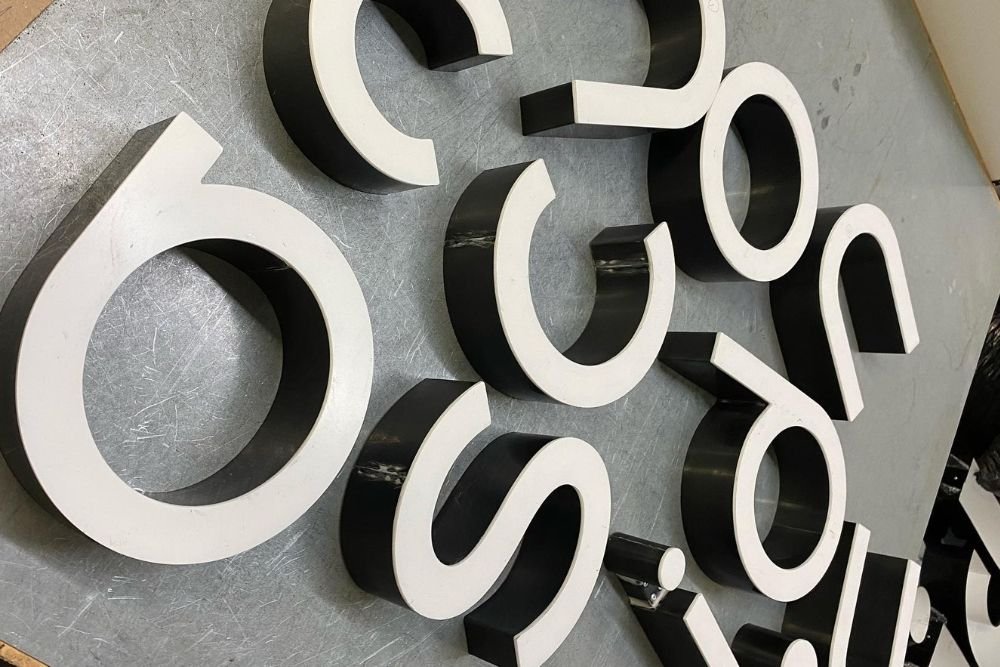
Various letters for a sign


Ensure That Your sign Is Readable

When creating a storefront design, an important aspect to consider is how visible it will be from a distance. Think about people who are across the street or in a vehicle that's in motion. Therefore, you should make sure that the words written on your signs are still readable from these different positions.


Improve Readability by Using Contrast

Readability is affected by more than the size of the letters. 

Font, color, and contrast also have a major impact on readability.

For instance, a high-quality outdoor banner made by a professional commercial signage company can have a positive impact on your business. However, it must be placed in the proper location, as sun glare could potentially make it harder to read the sign. So if you're planning on hanging a banner sign in an area that gets a lot of direct sunlight, ensure that there will be sufficient contrast between the text and the background color. 

Also, keep in mind that pairing colors that are too similar can make the sign blend together too much, lowering its readability.

If readability is especially important to you, then you should strongly consider using one of these color combinations. These are reported by the Outdoor Advertising Association of America to be the most legible color combinations:

  • Green on White

  • Yellow on black

  • Black on Yellow

  • White on Blue

  • Black on White


Consistent Branding and Marketing

Customers may end up passing your store up to 30 times per month if it's on their way home or to their workplace. Business signage works for at all hours and is visible even during non-business hours. This gives you an excellent opportunity to build your brand 24/7.

As we touched on earlier, window decals can help in displaying useful information, such as your store's business hours, what payment methods are accepted, and new sale announcements. Think about the subtle details of your signage and graphics and create a consistent and cohesive look all throughout your business, both online and offline.


Less Is More

When it comes to designing a store sign, keep in mind that less is more. With products that can be read more closely, like brochures or flyers, you can take more liberty in using various design options. A patterned background might look lovely on a flier but would be less effective as store signage. With signs, you have to keep in mind the reading distance that's required to reach as many potential customers as possible. In short, it pays well to keep your message simpler and easier to read on a nice clean background.


Recap

We hope that these design tips will assist you in designing the perfect sign for your business. These tips will allow you to better define your sign's purpose and how it will be used to promote your business. The most important tips are to keep your tone and style consistent throughout your business and product offerings. And make sure that it is easy to read for everyone who is within viewing distance of your sign.

Midtown Signs is a commercial signage company in Kansas City. To create the best sign, it's usually a better idea to work with a local company. Get in touch with us for more information. You can also follow our blog for even more useful updates.

Comment

7 Ways That a Custom LED Sign Can Help Brand Your Business

Comment

7 Ways That a Custom LED Sign Can Help Brand Your Business

Custom outdoor business signs have the primary purpose of marketing your brand to your target customers. They can be placed on your storefront or inside of your business. These signs come in various shapes, sizes, and colors. But, your business sign should be appropriate for the image or brand you are aiming to promote. So, choosing a custom outdoor business sign is no small matter and should involve careful planning. That way, you will get the most brand recognition possible.

There are lots of different kinds of signs being made these days. One popular type is illuminated or LED business signs. These signs focus on adding lights to enhance or highlight important details on the sign. It can also function as lighting for unlit areas in the establishment. LED is the most common source of lighting for most signs.

Listed below are some of the top benefits of custom outdoor business signs and why you should add one to your business.

 1.) Grab Attention Right Away

Think of how appealing city lights are. Or casino lights. What do they have in common? Well, they blink, they come in multiple colors, and they are accompanied by excitement and energy. You can bring all of this to your business in the form of one small and convenient package – your custom outdoor business sign! It’s guaranteed that you’ll turn some heads due to the inherent visual appeal that these signs possess. LED signs are the perfect choice for businesses, especially if the business is located on a busy street or area.

2.) Advantageous at Night

Additionally, if your store operates at night, a bright sign serves as both a navigational beacon (like a lighthouse) and a warm welcome to potential customers. Of course, the biggest advantage is that it allows you to market your brand whenever you’d like – day or night, fog or shine.

And speaking of shine, a brightly lit sign at night gives reassurance that your business is indeed open and ready to receive customers. A dimly lit sign (or worse, malfunctioning) at night, on the other hand, would potentially scare away customers. So, it’s important that you have good quality signage, as not all custom outdoor business signs are made equal.

3.) Inspire Creativity and Innovation

Making an effective LED-lit sign will require you to think creatively and innovatively, especially when it comes to applying LED lighting. For example, how do you want to emphasize your sign? Should it be lit in the back or on the sides? Inside the signs? If you know where you want to put the lights, you can then decide which colors to use and the types of lights to add (strips or bulbs)

4.) Durable and Made to Last

To have an LED sign of the best quality, it’s important to spend a lot of money on good materials and a rigorous manufacturing process. Therefore, to make sure that you get what you’re paying for, you must do your due diligence to research reputable signage companies and check out their backgrounds. See their previous work and read through reviews and feedback from past clients. Was their experience good throughout the production process? Did they deal with customers professionally? Is the price fair? These are just a few key points to consider when choosing which company to hire to create your LED signage.

5.) Bring Versatility to Your Business

As LED signs come in variations, you’ll have lots of different options to consider. For example, you may want to have just a single color for your sign or include several different colors depending on what kind of sign you’d like to have for your company. Also, many people assume that LED signs are only useful outdoors, but that isn’t the case. They can be used to great effect in interiors. For instance, there are lobby signs that can be used for formal or professional establishments.

6.) Easy to Install and Adjust

Installing LED signage, despite what many think, is easy and hassle-free, regardless of where you’d like to install it. Indoors or outdoors, neither option is difficult to implement. Due to this ease of use and the many great features that they provide, they have been used in both industrial and commercial applications. In fact, you can even change the contrast, color options, and brightness to make the sign more reliable as a long-term marketing strategy so that you can make adjustments as needed.

LED signs come equipped with accessories and can be used flexibly, particularly when it comes to LED strip lights. These strips can be cut the way that you’d prefer. The majority of LED lights take advantage of adhesive during installation and are already waterproofed. That way, they will be more resistant to the weather and heavy rainfall. The adhesive, on the other hand, allows the lights to stick to almost any surface, which makes LED signs an even more flexible option for businesses.


7.) The Best Source of Lighting

When we think of the 80s and 90s, neon signs were famous back then, and that’s for a good reason. They are appealing and alluring, which is why businesses still incorporate them into their signages today. There is no other type of sign that can display colors better than an LED type can. Adjusting the brightness is a big deal, not only for the attractiveness of the sign but also for energy conservation.

Additionally, this kind of sign is frequently made interactive. That way, lighting effects can be changed to achieve the visual goal that’s intended by the sign.

If you’re considering custom outdoor business signs with LED lighting, it’s best to first plan where you want the sign to be located so that you can be aware of where the electrical source fueling it will be. There is no need to worry about replacing lights all the time as they will only need little maintenance and will not consume very much electricity. 

Comment