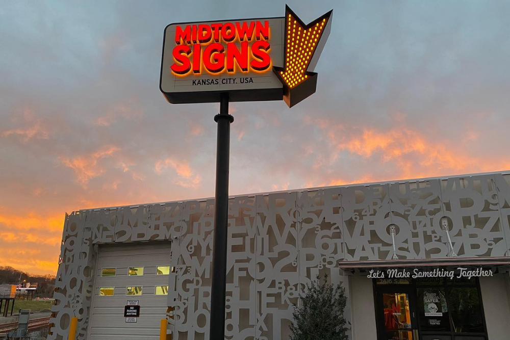
If you want to make your storefront popup, using the best sign design will help you to achieve that goal. It should be done as early as the product launch or introduction of your brand. Whatever goal you might have, using the right sign will make your shop pop up and be known to your target market.
People are visual by nature, and getting their attention is the best way to grow your business. It will help your brand to be associated with an image that consumers will remember. These visual tools will communicate with potential customers. Using custom outdoor business signs is an important part of the marketing process.
The 10 Best Sign Design Ideas to Make Your Storefront Pop
Custom outdoor business signs are great tools for your brand. It will help your business to become well known and popular. Using the best sign design will get the attention of consumers. It will make your business more popular than not having the right sign design.
1. Use a Creative Name
Having a creative name is one of the most important elements of a sign design. It's where everything will be based. Think of a creative store name that is easy to remember. Avoid using words that are hard to read. Make it memorable for everyone who will see your business name.
The sign design will be more effective if you use a creative name. It should be memorable even for the passersby. Using a unique and creative name for your business will help a lot with marketing. Make it sound intriguing so people can't resist checking out what you have to offer.
2. Make Use of Symbolism
Symbolism is another great way of making your business appealing. Make sure that you will use the right symbol for your store. It will avoid misunderstandings if you choose the perfect symbolism for your brand. Find something that will describe your business even without using letters.
Make the symbol bold and huge to catch a lot of attention. If you plan on using symbolism for your storefront, make sure that it will describe your business well. It must be something that people will remember when they see a specific image. People should think about your brand when they see it.
3. Wordless Sign
Using an image alone can make your storefront pop even without the texts. If you want people to remember your business, try using a wordless sign. Make sure that the image will suit how your business operates. Make it colorful and artistic to catch the attention of your target market.
4. Image Reflection
Use a sign design that will reflect the image of your brand. Avoid using texts alone since some people are visual beings. They can associate your business with the image reflecting the name of your brand. Make sure it's clear, easy on the eyes, and catchy. This sign design should make consumers walk inside your store.
5. Take Advantage of Every Side
If you have more than one wall facing the road, take advantage of this opportunity. It's important to have your main sign in front of the public. But if you can have two or more, it's best to make use of all the sides of the building to display your brand.
It will allow you to market your business in every direction possible. The outdoor signs should be on every wall facing the traffic. It will cover a wider area to tell people that you're ready to do business. Use bold colors that will attract more attention and make the letters of your sign stand out.
6. Wall and Sign
It's a good idea to make your sign become the wall of your storefront. This clever design will make your business have a sign and wall in one. It looks creative as well and will grab the attention of the passersby. Use bright and bold letters to complete the look of this design idea.
7. Simple Symbols
Depending on your business, using simple symbols can go a long way. If you prefer to have your sign design simple, use contrasting colors. Make the texts easy to read so that they will still become memorable. Even with simple symbols, your storefront will stand out if you use the right colors.
8. Illuminate the Sign
If your business operates at night, illuminating the sign will make it pop. The lights will be easier for people to locate your business. It will also make your business name easier to read. Using lights will also make the sign more appealing and enticing.
Illuminating your sign is also helpful if your business is located in a dark area of the street. It will help people to find your business easily. Have the letters illuminated with a brightly colored background? That will help your sign to stand out in a dark location, even if it's the nighttime.
9. Match the Architecture
If your business is located in a building, make sure to match it with the architecture. The sign must look unique but should not overpower the building design. Take advantage of your location and make the sign look like a part of the building.
Matching the building's architecture will not only make your store look classy. It will also make people curious about what you have to offer. Choose a sign design that will make your business stand out without being an eyesore.
10. Have an Evocative Sign
Make sure that your business sign will look evocative. It should trigger memories and feelings when somebody looks at the sign. Use a simple but memorable design to make your business stand out. Solid colors and highlights on the text are also recommended. The storefront will still pop with a simple yet evocative sign.
Conclusion
Using custom outdoor business signs will make your brand have its own personality. The sign design doesn't have to be grand. Make it memorable to keep customers from coming back. It's another way of marketing your business, and having an excellent sign is essential. If you’re in the market for a new sign, contact us for a quote today!


